


- Bài 1: Giới thiệu Matplotlib
- Bài 2: Môi trường cài đặt
- Bài 3: Jupyter Notebook
- Bài 4: Pyplot API
- Bài 5: Khái niệm cơ bản về Plot
- Bài 6: PyLab
- Bài 7: Giao diện hướng đối tượng
- Bài 8: Figture và Axes
- Bài 9: Multiplots
- Bài 10: Hàm Subplots() và Subplot2grid()
- Bài 11: Grids
- Bài 12: Định dạng Axes
- Bài 13: Đặt giới hạn X và Y
- Bài 14: Trục đôi
- Bài 15: Bar Plot
- Bài 16: Histogram
- Bài 17: Pie Chart ( Biểu đồ tròn )
- Bài 18: Scatter Plot ( Biểu đồ phân tán )
- Bài 19: Contour Plot ( Đồ thị đường bao )
- Bài 20: Quiver Plot
- Bài 21: Box Plot ( Biểu đồ nén)
- Bài 22: Violin Plot
- Bài 23: Three-dimensional Plotting ( Biểu đồ 3 chiều )
- Bài 24: 3D Contour Plot ( Biểu đồ viền 3D )
- Bài 25: 3D Wireframe plot
- Bài 26: 3D Surface plot
- Bài 27: Làm việc với văn bản
- Bài 28: Biểu thức toán học
- Bài 29: Làm việc với ảnh
- Bài 30: Transforms ( Biến đổi trục )
Bài 14: Trục đôi - Matplotib Cơ Bản
Đăng bởi: Admin | Lượt xem: 2711 | Chuyên mục: AI
1. Khái niệm :
Trục đôi được coi là hữu ích khi có trục x hoặc y kép trong một hình. Ngoài ra, khi vẽ các đường cong với các đơn vị khác nhau v. Matplotlib hỗ trợ bằng hàm twinx và twiny.
Trong ví dụ sau, biểu đồ có trục y kép, một trục hiển thị exp (x) và trục kia hiển thị log (x) -
import matplotlib.pyplot as plt
import numpy as np
fig = plt.figure()
a1 = fig.add_axes([0,0,1,1])
x = np.arange(1,11)
a1.plot(x,np.exp(x))
a1.set_ylabel('exp')
a2 = a1.twinx()
a2.plot(x, np.log(x),'ro-')
a2.set_ylabel('log')
fig.legend(labels = ('exp','log'),loc='upper left')
plt.show()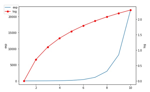
2. Ví dụ :
Ví dụ 1 : Các tỷ lệ khác nhau trên cùng một trục
Demo cách hiển thị hai thang đo trên trục y bên trái và bên phải.
Ví dụ này sử dụng thang đo độ F và độ C.
import matplotlib.pyplot as plt
import numpy as np


def fahrenheit2celsius(temp):
    """
    Returns temperature in Celsius.
    """
    return (5. / 9.) * (temp - 32)


def convert_ax_c_to_celsius(ax_f):
    """
    Update second axis according with first axis.
    """
    y1, y2 = ax_f.get_ylim()
    ax_c.set_ylim(fahrenheit2celsius(y1), fahrenheit2celsius(y2))
    ax_c.figure.canvas.draw()

fig, ax_f = plt.subplots()
ax_c = ax_f.twinx()

# automatically update ylim of ax2 when ylim of ax1 changes.
ax_f.callbacks.connect("ylim_changed", convert_ax_c_to_celsius)
ax_f.plot(np.linspace(-40, 120, 100))
ax_f.set_xlim(0, 100)

ax_f.set_title('Two scales: Fahrenheit and Celsius')
ax_f.set_ylabel('Fahrenheit')
ax_c.set_ylabel('Celsius')

plt.show()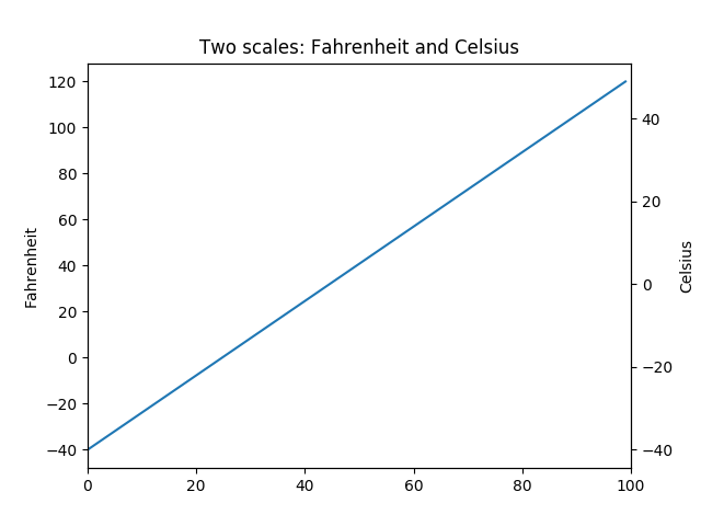
Ví dụ 2 : Các plot với các tỷ lệ khác nhau
Hai plot trên cùng một trục với tỷ lệ bên trái và bên phải khác nhau.
Bí quyết là sử dụng hai trục khác nhau có cùng trục x. Bạn có thể sử dụng các bộ định dạng và bộ định vị matplotlib.ticker riêng biệt vì hai trục là độc lập.
Các trục như vậy được tạo ra bằng cách gọi phương thức Axes.twinx (). Tương tự như vậy, Axes.twiny () có sẵn để tạo ra các trục có chung trục y nhưng có tỷ lệ trên và dưới khác nhau.
import numpy as np
import matplotlib.pyplot as plt

# Create some mock data
t = np.arange(0.01, 10.0, 0.01)
data1 = np.exp(t)
data2 = np.sin(2 * np.pi * t)

fig, ax1 = plt.subplots()

color = 'tab:red'
ax1.set_xlabel('time (s)')
ax1.set_ylabel('exp', color=color)
ax1.plot(t, data1, color=color)
ax1.tick_params(axis='y', labelcolor=color)

ax2 = ax1.twinx()  # instantiate a second axes that shares the same x-axis

color = 'tab:blue'
ax2.set_ylabel('sin', color=color)  # we already handled the x-label with ax1
ax2.plot(t, data2, color=color)
ax2.tick_params(axis='y', labelcolor=color)

fig.tight_layout()  # otherwise the right y-label is slightly clipped
plt.show()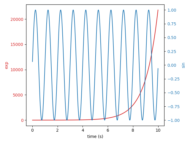
Ví dụ 3 : Phần trăm dưới dạng biểu đồ thanh ngang
Biểu đồ thanh rất hữu ích để hiển thị số lượng hoặc thống kê tóm tắt với các thanh lỗi. Ngoài ra, xem biểu đồ thanh được nhóm có label hoặc ví dụ về biểu đồ thanh ngang để biết các phiên bản đơn giản hơn của các tính năng đó.
Ví dụ này xuất phát từ một ứng dụng trong đó giáo viên thể dục của lớp muốn có thể cho phụ huynh thấy con họ đã làm như thế nào qua một số bài kiểm tra thể lực và quan trọng là liên quan đến cách những đứa trẻ khác đã làm. Để trích xuất cho mục đích demo, ta sẽ chỉ tạo một số dữ liệu nhỏ.
import numpy as np
import matplotlib
import matplotlib.pyplot as plt
from matplotlib.ticker import MaxNLocator
from collections import namedtuple

np.random.seed(42)

Student = namedtuple('Student', ['name', 'grade', 'gender'])
Score = namedtuple('Score', ['score', 'percentile'])

# GLOBAL CONSTANTS
testNames = ['Pacer Test', 'Flexed Arm\n Hang', 'Mile Run', 'Agility',
             'Push Ups']
testMeta = dict(zip(testNames, ['laps', 'sec', 'min:sec', 'sec', '']))


def attach_ordinal(num):
    """helper function to add ordinal string to integers

    1 -> 1st
    56 -> 56th
    """
    suffixes = {str(i): v
                for i, v in enumerate(['th', 'st', 'nd', 'rd', 'th',
                                       'th', 'th', 'th', 'th', 'th'])}

    v = str(num)
    # special case early teens
    if v in {'11', '12', '13'}:
        return v + 'th'
    return v + suffixes[v[-1]]


def format_score(scr, test):
    """
    Build up the score labels for the right Y-axis by first
    appending a carriage return to each string and then tacking on
    the appropriate meta information (i.e., 'laps' vs 'seconds'). We
    want the labels centered on the ticks, so if there is no meta
    info (like for pushups) then don't add the carriage return to
    the string
    """
    md = testMeta[test]
    if md:
        return '{0}\n{1}'.format(scr, md)
    else:
        return scr


def format_ycursor(y):
    y = int(y)
    if y < 0 or y >= len(testNames):
        return ''
    else:
        return testNames[y]


def plot_student_results(student, scores, cohort_size):
    #  create the figure
    fig, ax1 = plt.subplots(figsize=(9, 7))
    fig.subplots_adjust(left=0.115, right=0.88)
    fig.canvas.set_window_title('Eldorado K-8 Fitness Chart')

    pos = np.arange(len(testNames))

    rects = ax1.barh(pos, [scores[k].percentile for k in testNames],
                     align='center',
                     height=0.5,
                     tick_label=testNames)

    ax1.set_title(student.name)

    ax1.set_xlim([0, 100])
    ax1.xaxis.set_major_locator(MaxNLocator(11))
    ax1.xaxis.grid(True, linestyle='--', which='major',
                   color='grey', alpha=.25)

    # Plot a solid vertical gridline to highlight the median position
    ax1.axvline(50, color='grey', alpha=0.25)

    # Set the right-hand Y-axis ticks and labels
    ax2 = ax1.twinx()

    scoreLabels = [format_score(scores[k].score, k) for k in testNames]

    # set the tick locations
    ax2.set_yticks(pos)
    # make sure that the limits are set equally on both yaxis so the
    # ticks line up
    ax2.set_ylim(ax1.get_ylim())

    # set the tick labels
    ax2.set_yticklabels(scoreLabels)

    ax2.set_ylabel('Test Scores')

    xlabel = ('Percentile Ranking Across {grade} Grade {gender}s\n'
              'Cohort Size: {cohort_size}')
    ax1.set_xlabel(xlabel.format(grade=attach_ordinal(student.grade),
                                 gender=student.gender.title(),
                                 cohort_size=cohort_size))

    rect_labels = []
    # Lastly, write in the ranking inside each bar to aid in interpretation
    for rect in rects:
        # Rectangle widths are already integer-valued but are floating
        # type, so it helps to remove the trailing decimal point and 0 by
        # converting width to int type
        width = int(rect.get_width())

        rankStr = attach_ordinal(width)
        # The bars aren't wide enough to print the ranking inside
        if width < 40:
            # Shift the text to the right side of the right edge
            xloc = 5
            # Black against white background
            clr = 'black'
            align = 'left'
        else:
            # Shift the text to the left side of the right edge
            xloc = -5
            # White on magenta
            clr = 'white'
            align = 'right'

        # Center the text vertically in the bar
        yloc = rect.get_y() + rect.get_height() / 2
        label = ax1.annotate(rankStr, xy=(width, yloc), xytext=(xloc, 0),
                            textcoords="offset points",
                            ha=align, va='center',
                            color=clr, weight='bold', clip_on=True)
        rect_labels.append(label)

    # make the interactive mouse over give the bar title
    ax2.fmt_ydata = format_ycursor
    # return all of the artists created
    return {'fig': fig,
            'ax': ax1,
            'ax_right': ax2,
            'bars': rects,
            'perc_labels': rect_labels}


student = Student('Johnny Doe', 2, 'boy')
scores = dict(zip(testNames,
                  (Score(v, p) for v, p in
                   zip(['7', '48', '12:52', '17', '14'],
                       np.round(np.random.uniform(0, 1,
                                                  len(testNames)) * 100, 0)))))
cohort_size = 62  # The number of other 2nd grade boys

arts = plot_student_results(student, scores, cohort_size)
plt.show()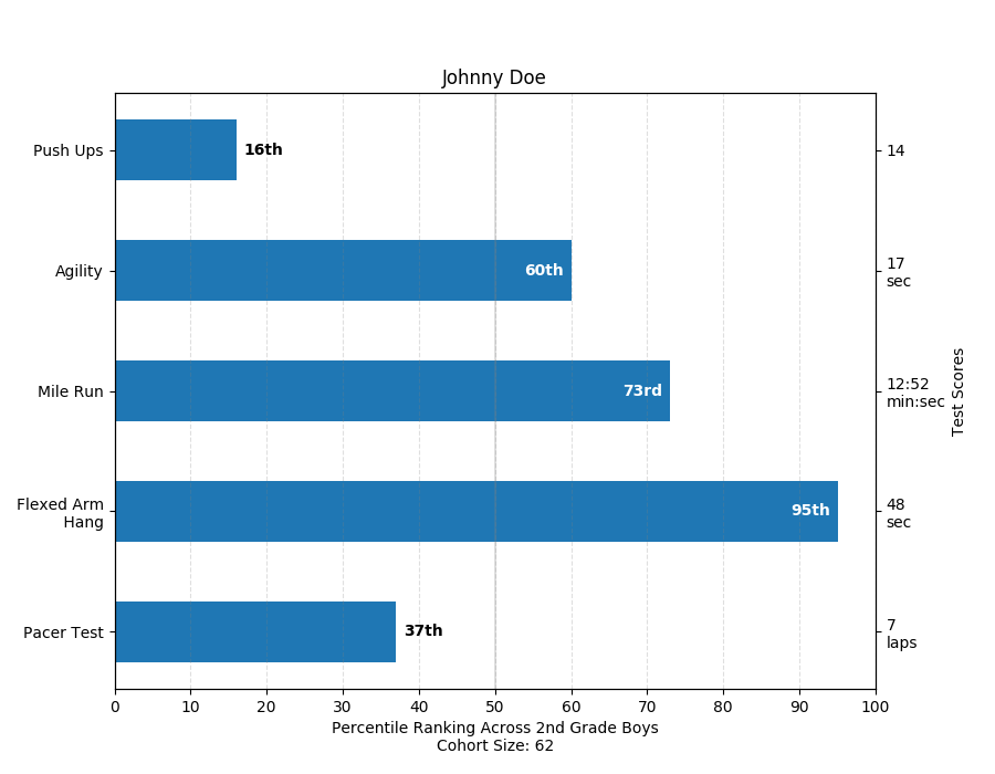
Theo dõi VnCoder trên Facebook, để cập nhật những bài viết, tin tức và khoá học mới nhất!
- Bài 1: Giới thiệu Matplotlib
- Bài 2: Môi trường cài đặt
- Bài 3: Jupyter Notebook
- Bài 4: Pyplot API
- Bài 5: Khái niệm cơ bản về Plot
- Bài 6: PyLab
- Bài 7: Giao diện hướng đối tượng
- Bài 8: Figture và Axes
- Bài 9: Multiplots
- Bài 10: Hàm Subplots() và Subplot2grid()
- Bài 11: Grids
- Bài 12: Định dạng Axes
- Bài 13: Đặt giới hạn X và Y
- Bài 14: Trục đôi
- Bài 15: Bar Plot
- Bài 16: Histogram
- Bài 17: Pie Chart ( Biểu đồ tròn )
- Bài 18: Scatter Plot ( Biểu đồ phân tán )
- Bài 19: Contour Plot ( Đồ thị đường bao )
- Bài 20: Quiver Plot
- Bài 21: Box Plot ( Biểu đồ nén)
- Bài 22: Violin Plot
- Bài 23: Three-dimensional Plotting ( Biểu đồ 3 chiều )
- Bài 24: 3D Contour Plot ( Biểu đồ viền 3D )
- Bài 25: 3D Wireframe plot
- Bài 26: 3D Surface plot
- Bài 27: Làm việc với văn bản
- Bài 28: Biểu thức toán học
- Bài 29: Làm việc với ảnh
- Bài 30: Transforms ( Biến đổi trục )